RE-DESIGNING A NONPROFIT's website
USER EXPERIENCE • INTERFACE DESIGN
Project Brief
The original OneCranston Health Equity Zone (OCHEZ) website, created by a third-party web developer, had many dead links. Our team had difficulty making edits or updates to it. Additionally, the incomplete website looked unprofessional and untrustworthy to visitors, which was not ideal for the organization.
The Proposal
Launch a new and updated website with a simple yet playful interface. Its main purpose is to provide residents and potential community partners with more meaningful information about health equity, the programs and services offered by OCHEZ, and ways for residents to get involved. Our goal was to establish a stronger sense of trust with residents and future partners or stakeholders.
The challenge of the existing website
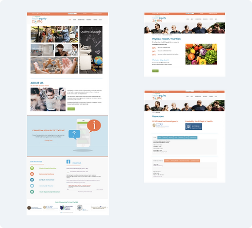
We looked at the older website to determine any usability issues and other problematic areas that can be improved to address our organization's and users’ needs.
Several issues we found that might discourage residents from being involved were:
-
Lack of evidence that OCHEZ was trying to improve the livelihood of people within the community
-
Lack of information about current OCHEZ projects and issues they were working on
-
No information on how someone can volunteer or get involved
-
Website wasn’t complete and portrayed OCHEZ in an unreliable light
.png)
Determining user needs and pain-points
To gain a deeper understanding of how to tackle the issue, we conducted a series of user surveys and interviews. All 15 individuals we surveyed were residents of the three census tracts that our organization is concentrating on.
PAIN
As individuals, people felt like they couldn’t help make a difference in issues within their community.
PAIN
People wanted to work alongside organizations that shared the same values as them and were trustworthy by other residents or community organizations
We asked questions like, "What prevents you from getting involved with community organizations?" and "Are there any factors that influence your decision to engage with an organization?"
NEED
Improve people’s understanding and awareness about OCHEZ’s mission and work
NEED
Provide easy access to resources and services that OCHEZ provides
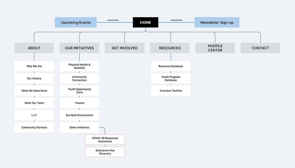
Restructuring the site map
We wanted to work on the site's information architecture as early as possible. This helped us lay out all the content and elements we wanted to add to the new website and arrange it in a simple way for users to navigate through.
New additions to site map:
-
The addition of 'Get Involved' page
-
Removal of the 'Blog' page
-
Expansion on the 'Resources' tab
Wireframes & Prototypes
When creating the wireframes, I paid particular attention to the site's interface, ensuring it would be simple, especially since some sections are very content-heavy.
My goal was to encourage users to explore the website, access concise information with just a few clicks, and find it visually appealing.
I developed an interactive low-fidelity prototype on Adobe XD using the wireframes as a guide. I wanted the prototypes to imitate how the user will navigate throughout the site when performing key tasks such as looking up our initiatives or our organization's history.
.png)
The end product
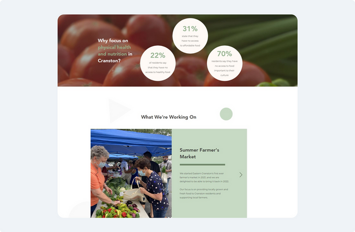
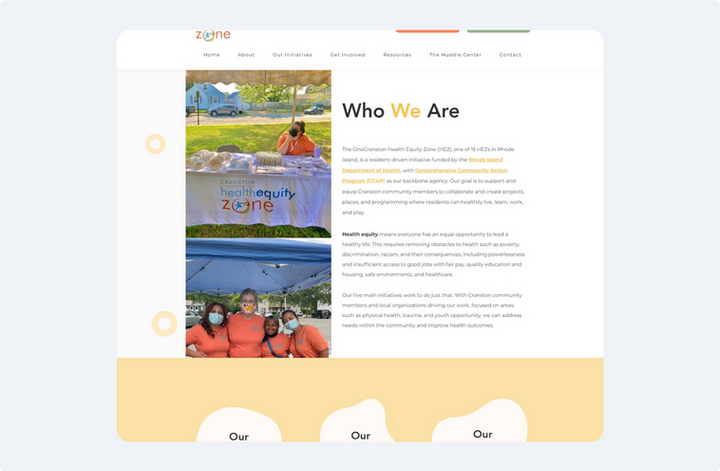
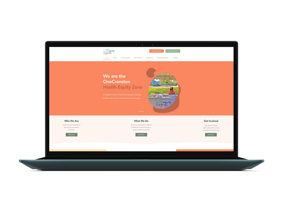
With the nonprofit organization's growth and rebranding, we seized the opportunity to revamp the website and inspire resident participation in community events and initiatives. Through the vibrant pastel color palette and captivating visual imagery, we have crafted a digital experience that can be shared with residents and community partners, effectively conveying OneCraston Health Equity Zone's story and mission.
Learnings & Reflections
Lessons Learned
1. Importance of User Testing: This project highlighted the importance of ongoing user testing in the design process. After receiving feedback on confusing elements, I began conducting user testing to minimize rework between pages.
2. Responsive Layout: The biggest challenge in this project was the fact that I had to not just work on creating a uniform web experience, but also carry that experience to a mobile and tablet browser design. Wix allows you to be able to design both web and mobile interfaces.
Next Steps
I want to make the new website more engaging by integrating a events calendar system on the homepage to showcase our monthly events and attract new members. Currently, users can view a PDF of our monthly calendar by clicking on the 'Upcoming Events' button. I will explore Wix's plug-in library if time allows.
ORGANIZATION
OneCranston Health Equity Zone
ROLE
UI Design, conducted user testing, web developer, content writer
PROJECT TYPE
Website Development
TIMELINE
January - July 2022

